"Everyone has a plan 'till they get punched in the mouth" - Mike Tyson

March 20, 2013

Copper

Plenty of folks are bearish copper.  They see that wedge breakdown and assume that's that.  Well that may not be the case here.  We see copper hit this now four year support line.  Today we got the bounce higher right where you would expect it.  

  
As long as this line holds we have to back off the bearish stance.  The whole technical picture seems to be pointing lower with potential rounding tops, head and shoulders etc.  However, we have seen patterns like this form and then reverse somewhat frequently over the last few years.  With that in mind we need to consider all possibilities.  What if copper bounces and stabilizes?

Lets's look at the most pure copper stock out there Southern Copper (SCCO).  This first chart is the long term view.  We can see what looks to be a pretty clean cup and handle pattern.  Or, you may interpret it as a double top.


Let's take a look at the shorter term chart to determine the potential pattern.


We see it has fallen in a somewhat aggressive falling channel. Today's action (3/20) appears to be stopping the downside momentum.  RSI is also forming a bull divergence and suggesting this is a good level to attempt a long position.  If this is a bottom, we have a potential double bottom price pattern here that would target the cup highs....meaning the larger pattern would favor a cup and handle pattern.

Hell, who knows what will happen that far out, but the stock itself looks pretty good here for a long trade.

I'm not saying copper doesn't look like it will eventually move lower.  I'm saying that given the whole picture copper prices may stabilize for awhile over that key support line.  Time will tell.

We can discuss this further.  Tweet me @aro618 on twitter/stocktwits
 

March 19, 2013

The importance of time

WD Gann was a huge proponent of time confluences.  He believed time confluences combined with price clusters were the strongest technical signals in the market.  

Here we have a 30 minute chart of the recent spy action.  We see the large wedge that formed, but also fooled us when it didn't break down immediately.  However, we have the lower boundary of the wedge as a price resistance signal.

This is where time signals come into play.  As the wedge's trend-lines met(our time confluence), price essentially topped.  It then continued to make the head and shoulders top which we are currently falling from.


The point is we have to leave our trend-lines on the screen and extended to the right.  They don't have to come from price patterns, they just need to prove their significance with 3-4 touches.

By the way. sorry I wasn't able to point this out ahead of time.  I have too much U.S. education :)


March 18, 2013

Searching for clues

I'm evaluating a new tool for future use and wanted to share some thoughts.    

This tool is a growth to value ratio using S&P indices.  Right off the bat, we can see this ratio generally trends the opposite direction of the S&P 500.  

Why has this ratio moved inversely to the market??  At first blush I thought this ratio would fall during market pull backs as growth names often have higher beta.  I guess that train of thought is too simplistic.  Well...  

We can say with confidence the very best stocks and stories in the market are growth names.  I think it's fair to say managers would want to hold those stocks on the way down while dumping the names with less going for them(aka value).

Right now the ratio has been falling from a major double top with fury as the rally keeps truckin'.  We see throughout the chart extreme differences between the two lines often mean revert.  

Currently, there is a one of these stretched differentials.  The RSI divergence sets up a large reversal which may coincide with a pullback in the S&P 500.  Take a look at early 2011.  The divergence built and finally sharply reversed higher.  It preceded a major top in the indices.  So far, this is somewhat comparable to the current action.

In the early 12' top, this served as a leading indicator of a weakening primary rally.  With the other smaller tops, we really get nothing of use.     

As we back this out the chart we see the upper boundary has acted a significant bottom signal.  The lower boundary is gives us very little practical use but the most recent touch acted as a significant top in the market.


Overall, this tool, as presented is something I'll look at once every month or so.  It isn't a perfect indicator, but we have a couple of decent uses for it and it seems to be a solid secondary piece of evidence.

If you think I missed something, give me a shout and we can discuss this further.  You can comment or tweet me @aro618 on twitter/stocktwits


March 17, 2013

Gas and Transports

I just wanted to take a look at spot gas prices and transports given the recent bullish argument of economic strength.  

This first chart is the recent action in spot gas prices.  We see it holding an important gap.  We can use that gap area to determine the short term trend in the coming weeks.  


Next is the long term view of gas prices.  Note the trend-line that has capped price back to the highs from 2008.  A move over this area may lead to a very sharp rise.   However, the equity markets have had a heck of a run and resistance hasn't broken.  Is this a real cap on fuel prices? 

Let's compare this chart to the Dow Transports over a similar time frame. 


For quite some time I pointed out the potential large rounding top in the Dow Transports Index.  The index has clearly invalidated this idea and has ripped nearly 20% from the breakout point.  

This signal is very strong and isn't likely to change over the next couple years. At this point these stocks look very buy-able on the next intermediate correction.  

BTW, this chart is definitely one reason Jim Cramer is recommending Airlines and rails.   


The major take-away here is the transports are leading fuel prices.  Is this because of increased economic strength?  If it was, wouldn't we expect fuel prices to confirm the action in the transports?

If this is a divergence that can't last, which end of this rubber band snaps back the other way?  Nothing says these have to move together.  It just seems logical that they would.  

Maybe the transports are leading as a the result of low interest rates and increased fuel efficiency?  Or Is it due to the North American energy boom?

Hell there are probably a few good talking points I missed.  I just thought I would share these charts as they stirred up some thought this weekend.

What do you think?


March 14, 2013

Deeper divergence analysis

This first chart is a ratio of high yield bonds to corporate bonds.  I use these first two charts as a measure of sentiment and risk appetite in the credit markets.  #1 shows a great example of RSI divergence blow-off in late 2010.  We can see a similar divergences building on this current run up.  

Since the tops are spread out, does that mean this can persist a while longer??  Regardless, this indicator tells us investor risk appetite is getting excessive.  The question is how excessive will it get?  


There are also similar divergences building in HYG / Treasury Bonds.  This also offered RSI blow-offs in late 10' / early 11'.  This chart simply confirms what we are seeing in the first chart.  Also, the divergences are interestingly flat vs HYG / LQD.  Does that tell us anything??


In the indices SPY & IWM we are seeing a possible variation of divergence blow-off in.  Ideally in a blow-off, we would see some parabolic upside action, followed by a sharp decline.  However, as I look around many people are expecting this...


IWM is confirming the divergence break we are seeing in SPY.


I'd love to hear some thoughts on this.  You can comment or tweet me @a_jackson on stocktwits @atmcharting on twitter


Matrix Services: an energy boom play

Matrix's (MTRX) largest segment is liquefied natural gas storage in Canada and North America.  Obviously, with the North American energy boom, demand is very high for such storage. They also operate in utility infrastructure, as well as providing industrial services and petrochemicals to the energy industry.  The fundamentals are improving (recently becoming operating cash flow positive), but that's enough of that for now!

This first chart is the long term weekly view.  


We see that this stock broke over a HUGE pivot level in January and is currently consolidating in a sideways continuation range.  The real key is the break over that gradual relative strength line.  This is very strong action.  Any real dip has our interest, but we may not get it.

This daily view shows MTRX trading in a wedging triangle and it seems to be biding time as the 50D moving average catches up to price.  A break above this consolidation leads to an 18.50 target with other targets higher at 21,24 and 30.

**update** this pattern broke down and moved lower until we bounced on 4/2 at a critical support area.


The trends clearly point higher over multiple timeframes.  Two other kickers: very little debt and this is currently trading at .5x sales.  Yeah .5 sales with positive earnings and exposure to the hottest area of our economy.  Nuff said.

UPDATE 4/2 : The stock has formed a bullish reversal at a multi year pivot area.  It is a smaller signal, but the action will tell us whether this is going to work now, or if the idea is just flawed.


If you want to discuss this further you can leave a comment or tweet me @a_jackson on stocktwits @atmcharting on twitter

Making money off of heart failure

First off, yeah I'm a bastard.  When I hear something like 'Heart failure is the leading cause of death in the U.S.', I think  "what is the best way to play it?"  I think the answer is Heartware (HTWR).

HTWR makes small implantable heart pumps for people with advanced heart failure.  The company is earnings and operating cash flow negative, but earlier this week the company sold 1.5 million shares to raise capital.

This first chart is the daily.  They keys here include the hold of the triangle's lower boundary, the great reaction to the secondary offering and the relative strength breakout.  


This second chart is the multi-year view.  We can see there is flat top resistance around 98, with higher lows forming over the last 2 years or so.  From this view we have a stock that is in a relatively safe entry area.  If you like the chart, but want to wait for more confirmation, you have a plethora of signals to wait for.         


Will this stock ultimately reach the highest possible target at 145?  Who knows, but the world's trends and the price history say this is an attractive buy right now.  Good luck out there!

If you want to discuss this further you can tweet me @aro618 on stocktwits/twitter

March 12, 2013

Update on option sentiment

Last week I dove into what the total put/call ratio was telling us here.  Now I just want to add an update and a new chart to the mix.

This first chart is the daily put call ratio (CPC).  I want to point out this week's action.  Monday's CPC was in line with other levels where the optimism needed to cool down.  Instead of just cooling down, today CPC swung to the other side of the fence!  This change in sentiment is kind of amazing since the Dow closed green today.  The crowd is volatile, and knee-jerk bearish.


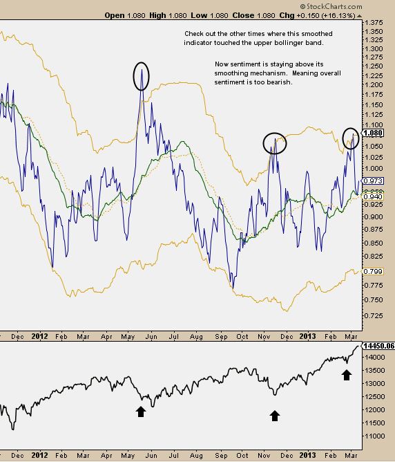
This next chart is a look at 2 moving averages of CPC(short term in blue, long term green).  In our last post, we noted how upper Bollinger Band touches by the fast MA was an intermediate term buy signal.

Currently, the fast MA has stayed above the slow (and rising) MA.  That tells us that overall sentiment is still quite bearish and essentially confirms the bullish signals we are seeing from CPC.


So what does all this tell us?  We can relatively safely assume these bears are under-invested.  Remember the market's #1 rule.  It will always disappoint most people....and most people seem to be betting against the rally here.

We may also infer that a strong rally over the next few days/weeks could turn the sentiment tide too bullish.

I want to add that I have an SPX target range of 1590-1620 and a 99 target on IWM.  If/when we move there and reach SPX all time highs, a psychological turning point may be at hand.   


Have any comments or disagree with something you see?  Feel free to ping me @aro618 on twitter/stocktwits.  I'd love to discuss this further.


**Update 3/14/13** we are getting close to a very bearish reading in these indicators.  This changed REAL fast.

Signs of rotation out of housing & real estate

The housing ETF XHB is displaying possible topping patterns in relative strength and price.  You can see the distribution on the last dip, followed by this weak push higher.  I would also include a chart of ITB, but it is a mirror image of XHB.


 Real estate has already broken a gradual relative strength support line dating back to the start of the housing rally in Q4 2011.  Price looks somewhat healthy, but the loss of this support line is huge.  I think of it as trying to skiing up hill.  Prices may still go higher, but eventually it will reverse.  This line break implies this will be a weak group on the next market decline.


Maybe this Real Estate chart says a lot more about interest rates than housing?  Maybe rates are leading real estate which is leading housing?  I'm not sure, but the signs of weakness and future under-performance are clearly present in both groups.

The key take away here is that the market has priced in very bullish expectations for the housing market and the group needs a rest.  Probably for a couple of market cycles (a year or two).  If you manage funds, you're portfolio is best served under-allocating this group in the intermediate future.

I'd love to hear any comments to clear things up/debate and will gladly chat on twitter/stocktwits.  You can tweet me @aro618.


March 07, 2013

Willbros

So you are probably wondering why we keep bringing up WG.  It's nothing more than a single digit over levered oil services company right?  Well....

Well, everybody talks about how awful it is that the Fed manipulates rates etc.  Most also fail to realize what a big buffer this is to highly levered companies.

We're in an era where unprofitable companies with strong businesses and decent management can use all sorts of software and other tools to figure out their problems and solve them.  With low interest rates, companies like Willbros can continue to re-structure debt until they figure out what they need to be consistently profitable.  They clearly understand the need to de-lever, as they understood the need to lever up and invest in the energy boom.

One concern out there may include falling energy prices, but they aren't involved in the drilling and exploration side.  They are more largely involved in the infrastructure side.  These guys do business in the Bakken and up in Canada.  We do know that this infrastructure build is still multiple years from being completed.

They posted results Wednesday  afternoon (early with concerns about leaked statements).  Numbers were solid, with hints of profitability appearing.  Here is a long term price map. Currently the stock is in a cup with handle pattern that breaks out over 7.50.


I'm not long.  I am considering it, but I mainly just wanted to share what I believe to be a great, underloved opportunity in the North American energy boom. Follow me on twitter/stocktwts @aro618 for more real time ideas.

March 06, 2013

AVG

We had to mention the setup here on this recent IPO.  Mobile and security software is a match made in Wall Street heaven.    PNF targets 29.  The next buy point of 16.40 measures to 20.  If you buy now leave yourself some room to buy more.

**update 3/6/13 4p.m. This looks like it is near a buy-able pullback.  Check @aro618 on stocktwits & twitter for real time updates

**update 3/8/13 This is a no touch name now.  CEO resigned, his replacement is up in the air. Often this leads to chop and losses.  This recently occurred in FIRE late last year.


**update** 3/12/13  This is no longer under consideration until a new CEO is found.  Price action should continue to be sloppy as the street doesn't like a CEO stepping aside so soon after the IPO.

The ghosts of past crashes are in play

This chart is the total put call ratio on an 8 day exponential moving average.  We use the bollinger band to find extremes moves in sentiment.  As you can see this works better on the upside moves.  Option sentiment has recently been wildly bearish, which is bullish for the markets.  This shows last week's fear reached levels of market bottoms.  This suggests we are starting a strong advance.  We were pretty surprised to see this and we even had the same mind set as the bears last week.  However, this data can't be ignored.


As you can see each time the total put call ratio reaches the upper bollinger band, we rally from around those levels. We searched back to 2004 and found no occurrence where that didn't happen.  Perhaps there is an alternate explanation.  We'd love to hear your thoughts!

March 05, 2013

The key area to watch in AWAY

AWAY has seen massive accumulation lately after breaking what I view as the IPO base.  This company is similar to Airbnb where consumers stay at other consumers places versus going to a hotel.   However, AWAY is the public's best (only?) way to play.  The base break targets at least 38, and we would love to invest in it.  The question is where do we buy?  Since there is little price history in the name we use other tools like the Point and Figure chart (more here:    http://support.stockcharts.com/forums/30077/entries/21293 ) and the Ichimoku Cloud (more here:   http://stockcharts.com/school/doku.php?id=chart_school:technical_indicators:ichimoku_cloud).


You can see this falling trendline just above at 32.  Basically a close over 32 confirms the base breakout signal.  Therefore, we can wait for it to happen and comfortably add.  


The weekly cloud chart shows the top of the cloud is close to being breached around 31.50.  This may be a large enough clue that 32 will also break.  Given the magnitude of these levels, we wouldn't be surprised if the signals came on a 6-7% gainer day.  It may be soon, so we're paying attention!


A look at Zillow's float

Zillow has just been on an incredible run lately since the bottom in November.  A cup with handle has now formed.  This move has been so deep and powerful the traditional 3 box PnF targets 90.  Clearly there is major demand for this stock.  


 I looked the recent fillings from funds with large ownership and recorded them in a table (there are likely errors).  I also took the short interest from mid-February and shares locked up.  Ofcourse these numbers aren't up to date but, it seems there is a real lack of supply here.  Clearly the consensus is the 1.6B valuation is too low.   Just thought this was worth pointing out.


GNMK base on base action

Genmark Diagnositics is a 2011 IPO that has been a huge winner that keeps forming base after base.  We can trade or own this against 10.  Targets include 11.75 and 14.  Note that earnings are March 12th after the close.  


Thanks for reading.  To show my appreciation, I'll start adding reader exclusives to blog posts.  No mentions on twitter, only here.
  
Check out this PHMD.  On Monday (2/4) there was an unusual volume surge.  The stock has traded in a very tight weekly pattern after a 50% gain off of the November lows. The key here is a very high short ratio of 25.  The current buy point is at 15.55.  This reports earnings in the morning on 3/13.


March 03, 2013

I heart scallops


My favorite chart setup
The goal of charting stocks is to find the easiest way to make money.  Generally, we want to find stocks under accumulation by large holders.  We then want to see rest periods where the large holders have little to no interest in selling, so we can hop on and catch the next lift up. 

Seems simple, right?  It can be, if you know what you’re looking for.  The pattern I’m examining today is called a scallop.  However, I use specific filters for this pattern to assure quality.  These patterns are hard to find.  When you find them and nail the trade, they’re worth all the work.         

The first pre-requisite of the scallop is months of clear accumulation and significantly rising prices (at least 30%).  After the rise, we want to see a price kind of stall out and trade sideways with a slight to gradual downward drift for a few months.  (charts courtesy of stockcharts dot com)    

There are two features that tell you this is a scallop.  First, there is a falling resistance line acting as an upper boundary on price, while the lower boundary is a bit of a rounding turn.  The rounding action is KEY because it tells you that the supply and demand balance has shifted. 

A couple notes on the turn:
-         ---When price starts to round look for increased volume.  This is another sign of accumulation.    
-          ---After the turn has been identified use the low as a stop area. 
-         ---  You want to enter as soon as the falling resistance line clears

 Recently, this pattern has hit for some big wins.  I nailed OPK & CAMP (but sold out much too soon) and tweeted them in real time on stocktwits. 

OPK is a great example of what happens when a quality pattern is supported by a small float and a lot of short sellers.   After the breakout around 4.60, it gained 50+% in 6-7 weeks.    

CAMP was a shorter pattern, but also highly efficient, quickly gaining 30+% from the buy point to the highs in 5 weeks.  Also note how the bottom came at a prior resistance level. 


A scallop currently playing out is CERS.  It rose 11% Friday on great volume after its earnings announcement.  This time we have clear resistance levels to shoot against.  Also, the short ratio of 31 suggests this could run another 20-40%.  Please note, I have no position and I’m not saying buy it here.  Do I think it’ll go higher?  Yes.


Lastly, you’re probably wondering why I have not mentioned targets.  Well, it is my experience often these gains come so fast you find yourself selling before they stop!  Thanks for reading.  Don’t let people tell ya you can’t time stock picks!! Happy Trading! 

Reminder:

All ideas shown on this blog represent the authors opinion based on the data available.